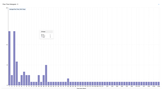
The Flow Time Histogram graph shows how long it takes to complete work items by displaying the distribution of completion times (in days). This helps teams understand their workflow efficiency and identify areas for improvement.
What does it show?
-
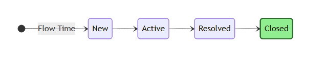
X-Axis (Flow Time): The time (in days) it took to complete work items. New -> Closed
-
Y-Axis (Count): The number of work items completed within the respective flow time.
-
Bars: Each bar represents a group of work items with the same flow time (in days).
Hovering over a bar displays:
- The total number of work items that took the selected number of days to complete.
- A breakdown by teams showing how many items were completed by each.

If the tooltip shows for 29 days:
- Total: 3 work items
- Team Green: 2 items
- Team Red: 1 items
This means 3 work items took 29 days to complete, with 2 completed by Team Green and 1 by Team Red.
The average flow time (displayed at the top of the graph) provides an overall summary of how long it typically takes to complete work items.
Flow Time is the total number of days it takes for a work item to move from start (New State) to completion. This includes all time spent in backlog, active and all states before closed.
The histogram aggregates this data and groups work items by their flow time for easy visualization.
-
Identify Workflow Efficiency:
- Short flow times indicate a streamlined and efficient process.
- Longer flow times highlight delays or bottlenecks.
-
Compare Teams:
- Hover over bars to see how different teams contribute to flow times.
-
Monitor Trends:
- Use the average flow time to track changes in your team's efficiency over time.
-
Focus on Improvement:
- Identify and address outliers with long flow times.
-
Filters:
- Teams: Narrow the data to specific teams.
- Planning Intervals: Analyze work completed during a specific Planning Interval.
- Work Item Types: Focus on particular types of work (e.g., Features, Stories).
-
Adjust Date Range:
- Select a PI to analyze trends over a specific period.
-
Expand View:
- Use the full screen toggle to enlarge the histogram for detailed analysis.
Q: What does a longer flow time indicate?
A: Longer flow times often point to delays or inefficiencies in your workflow. Investigating these items can help uncover process bottlenecks.
Q: How do I see team-specific data?
A: Hover over a bar to view the tooltip, which shows a breakdown of work items completed by each team.
Q: What is the significance of the average flow time?
A: The average flow time provides a quick overview of how long it typically takes to complete work items, helping you measure overall efficiency.