Nooga Scale Flow Metrics introduces the six SAFe flow metrics, enabling you to work with measuring and analyzing flow:

| Metric | Description |
|---|---|
| Flow Distribution | The Flow Distribution function provides a clear picture of how work items are dispersed across various workflow stages. It assists in uncovering potential bottlenecks, a critical aspect of effective planning. Utilizing this tool can help enhance overall productivity and process efficiency. |
| Flow Velocity | The Flow Velocity graph visually represents the volume of work in story points or effort accomplished within a specific timeframe. It serves as a valuable tool for detecting and addressing slowdowns in your workflow. |
| Flow Time | The Flow Time Histogram graph displays the number of work items and their respective completion times. It's a vital tool for understanding time efficiencies and potential areas for process improvement. |
| Flow Load | The Flow Load graph shows the number of work items in each state. This graph is useful for identifying bottlenecks in your workflow. |
| Flow Efficiency | Flow Efficiency is the percentage of time that work is actively being worked on. It is calculated by dividing the total active time by the total lead time. |
| Flow Predictability | Flow Predictability calculates the ratio of planned business value achieved to actual business value on PI objectives delivered in a PI. |
From the Nooga Scale dashboards dropdown, select Flow Metrics to start configuring the charts.

Using the filters, select the ART, work item types, teams, and program increments you want to include in the flow metric charts.

You can choose to look at one metric in isolation by toggling it into full-screen mode.

To dive into these insights, navigate to the analytics settings and enable the preview toggle.
Data Access: Our analytics are powered by Azure DevOps Analytics, ensuring up-to-date and accurate information. For access, users must have Basic access or higher within their Azure DevOps projects.
Cross-Project ARTs: For insights spanning multiple projects, ensure you have the necessary access across all involved projects to visualize the complete data set.
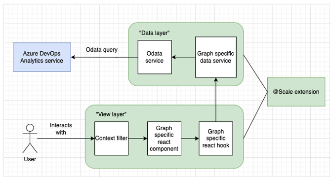
While the details of data queries and processing are managed by @Scale, it’s essential to understand the basics of how your analytics are generated:
- Data Sources: We extract data from multiple project IDs associated with your selected ART, using Azure DevOps Analytics services.
- Data Selection: Our system filters data based on date ranges, team IDs, and work item types that you specify in the analytics interface.
- Data Presentation: Aggregated and processed data is translated into user-friendly graphs and charts, offering actionable insights at a glance.
- User Interactions: Filters and selections you make dynamically alter the displayed data without the need for new queries, ensuring a responsive and fluid experience.
- Deepen your understanding of SAFe metrics through the Scaled Agile Framework's official metrics guide.
- Learn about the necessary permissions and prerequisites for accessing Analytics in Azure DevOps.
| Control | Function |
|---|---|
| Enter or exit full screen mode |